Data visualization
Institutions / Universities Dashboard
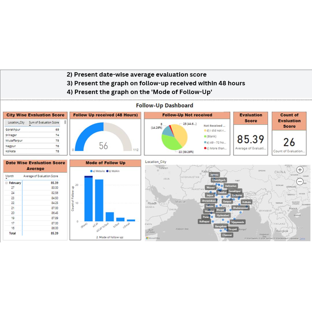
Interactive Power BI dashboard tracking city-wise evaluation scores, follow-up turnaround and engagement modes across institutions.
Overview
An end-to-end analytics project that turns raw institutional data into an interactive Power BI dashboard. It shows city-wise evaluation scores, date-wise averages, follow-ups received within 48 hours and the mode of each follow-up.
The data was collected in Excel, cleaned and explored in Python, then modelled and visualised in Power BI with slicers so stakeholders can filter by city, date and more.
Key features
01City-wise scoresAverage evaluation scores compared across cities.
02Follow-up trackingGauge of follow-ups received within 48 hours vs. not received.
03Trend over timeDate-wise average evaluation scores to spot patterns.
04Mode of follow-upBreakdown of how institutions were followed up with.
05Map viewLocation map of institutions for geographic context.
06Interactive slicersFilter every visual by city, date and category.
How it works
- Collect institutional data in Excel.
- Clean it with pandas: handle missing values, remove duplicates, fix formats.
- Explore it in Python (EDA, correlations, distributions) and build aggregated metrics.
- Visualise it in Power BI with charts, gauges, maps and slicers, then publish.
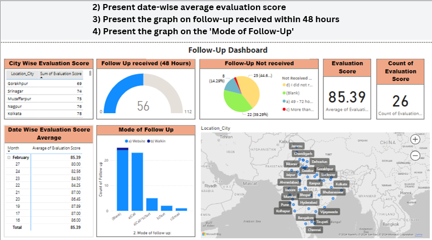
More screenshots
Contact
Let’s build something great together
Have a project, a role or just an idea? Send a message and I’ll get back to you soon.
Send a message
Your message comes straight to my inbox. I usually reply within a day or two.