Steps to Create the Institutional Dashboard
1. Data Preparation
1.1. Data Collection
- Collect institutional data in an Excel file. The dataset might include:
- Student demographics (e.g., gender, age, program)
- Academic performance (e.g., grades, pass/fail rates)
- Enrollment statistics
- Faculty information
- Financial data (e.g., budget allocations, expenses)
1.2. Data Cleaning
- Open Excel or use Python libraries like pandas to clean the data:
- Handle missing values (impute or drop).
- Normalize inconsistent formatting.
- Remove duplicates.
- Validate data for anomalies.
2. Data Analysis in Python
2.1. Exploratory Data Analysis (EDA)
- Use Python for statistical analysis and initial insights:
- Summary statistics (mean, median, mode).
- Correlations between variables.
- Distribution of numerical data.
2.2. Data Transformation
- Prepare aggregated or calculated metrics for the dashboard:
- Enrollment by year or program.
- Faculty-to-student ratio.
- Financial summaries.
3. Visualization Creation
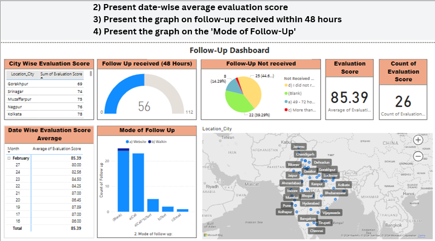
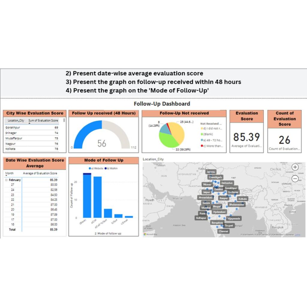
3.1. Using Power BI
Import Data:
- Load the cleaned and transformed dataset into Power BI using “Get Data” -> Excel or CSV options.
Design the Dashboard:
- Create visuals:
- Bar charts for enrollment trends.
- Pie charts for demographic splits.
- Line charts for financial performance.
- Tables for detailed data (e.g., top-performing students).
- Add slicers for interactivity (e.g., filter by department, year).
- Create visuals:
Format and Publish:
- Apply themes and format charts.
- Publish the dashboard to the Power BI service for sharing.
3.2. Visualization in Python
- Use libraries like Matplotlib, Seaborn, or Plotly to create complementary visuals for the dashboard.
4. Presentation Preparation
- Use PowerPoint to prepare a project presentation with:
- Overview: Objectives, scope, tools used.
- Key Insights: Highlight major findings from the data.
- Visuals: Include snapshots from Python or Power BI visualizations.
- Dashboard Demo: Explain the functionality and navigation of the Power BI dashboard.
Project Implementation Details
Python Code Summary
The Python code workflow includes:
- Reading and cleaning data.
- Performing EDA for insights.
- Aggregating metrics for visualization.
- Creating simple visuals with Matplotlib, Seaborn, or Plotly.
Power BI Dashboard
- Features:
- Dynamic slicers for filtering.
- Drill-down capabilities for detailed insights.
- Interactive charts and tables.
- Benefits:
- Easy sharing and access via Power BI cloud services.
- Scalability to handle large institutional data.
Conclusion
This project demonstrates how data visualization tools and programming can transform institutional data into actionable insights. By integrating Python’s analytical capabilities with Power BI’s interactivity, we created a powerful dashboard to support decision-making. The final PowerPoint presentation served as a medium to communicate findings effectively to stakeholders.


